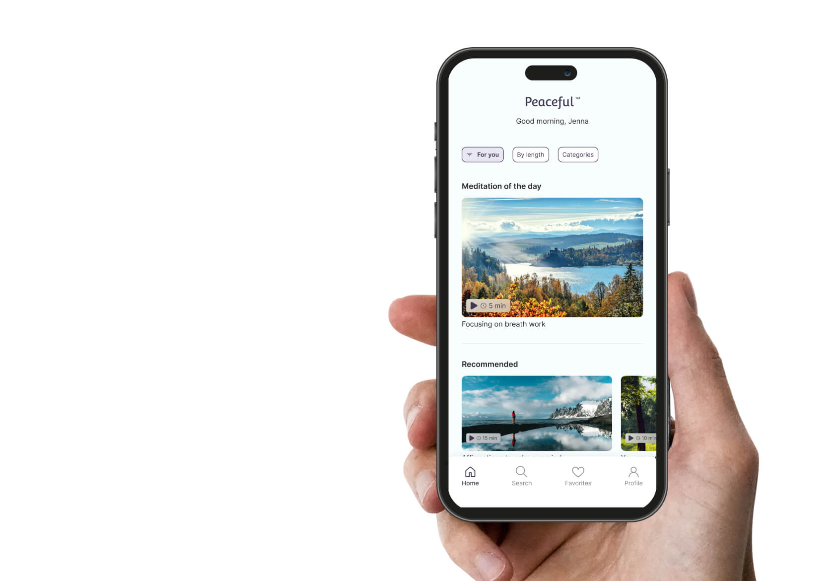
Peaceful Meditation App
Prototype
View Prototype
Tools
Figma
Completed
August 6th, 2024
Expertise
UI Design
User Research
Competitive Analysis
User Journey Mapping
Design Audit
Visual design
Prototyping
Testing
Problem Statement
In our fast-paced world, many people struggle with stress and anxiety but lack the time and resources for traditional stress-relief methods. Existing meditation apps often fail to provide personalized experiences, leading to inconsistent use and limited benefits.
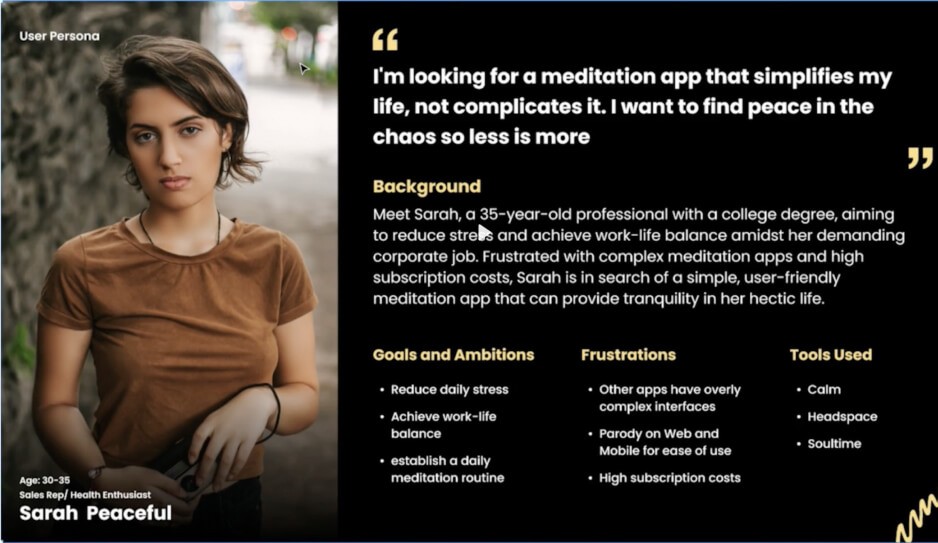
User Personas
Sarah is a busy professional working in a fast-paced environment. She loves her job but often feels stressed and overwhelmed by her responsibilities. She lives in a bustling urban area, which adds to her daily stress. Sarah is health-conscious and tries to maintain a balanced lifestyle, but she finds it challenging to allocate time for herself amidst her hectic schedule.
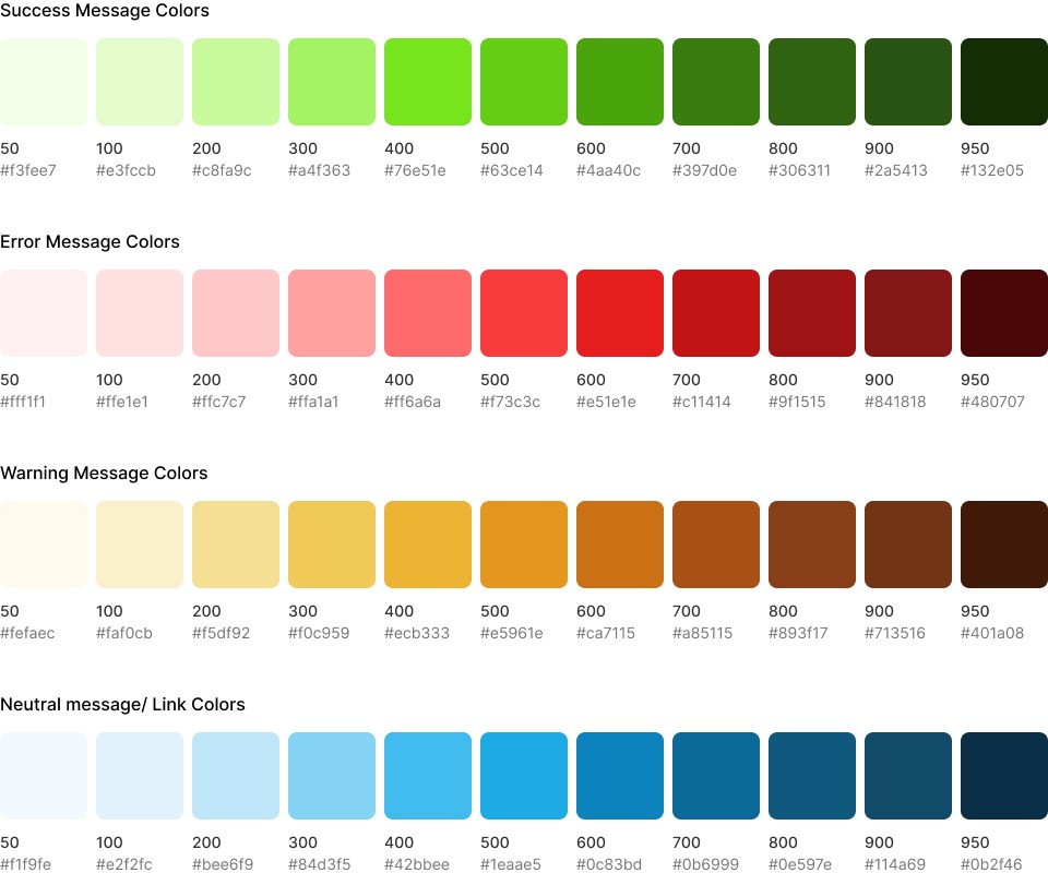
Color Palette
I applied the 60/30/10 rule to my color palette to achieve a balanced and harmonious design. The primary color, which makes up 60% of the palette, sets the overall tone and mood. The secondary color, at 30%, provides contrast and supports the primary color without overpowering it. Finally, the tertiary color, making up 10% of the palette, adds a touch of accent, creating visual interest and ensuring the design is both cohesive and dynamic.
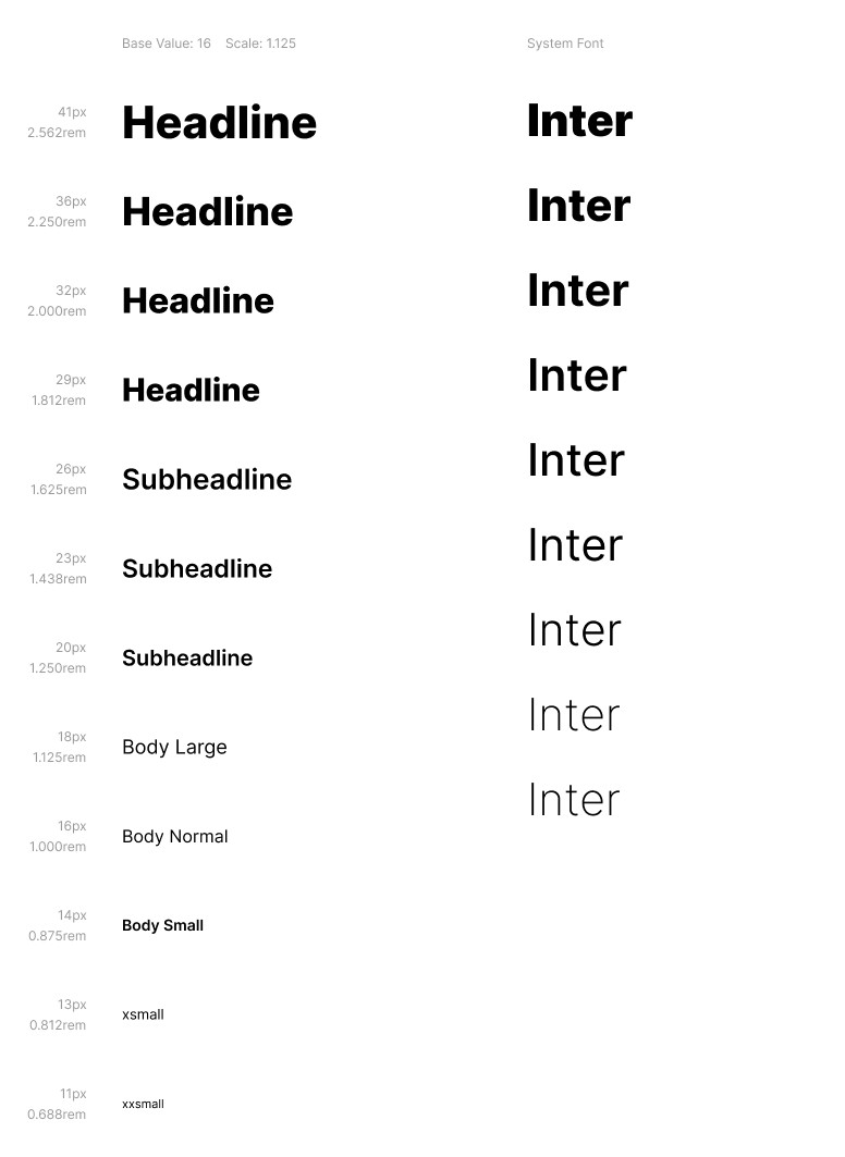
Typescale & Font
I used a base value of 16, with a 1.125 Typescale. I used Inter as the font.
Components
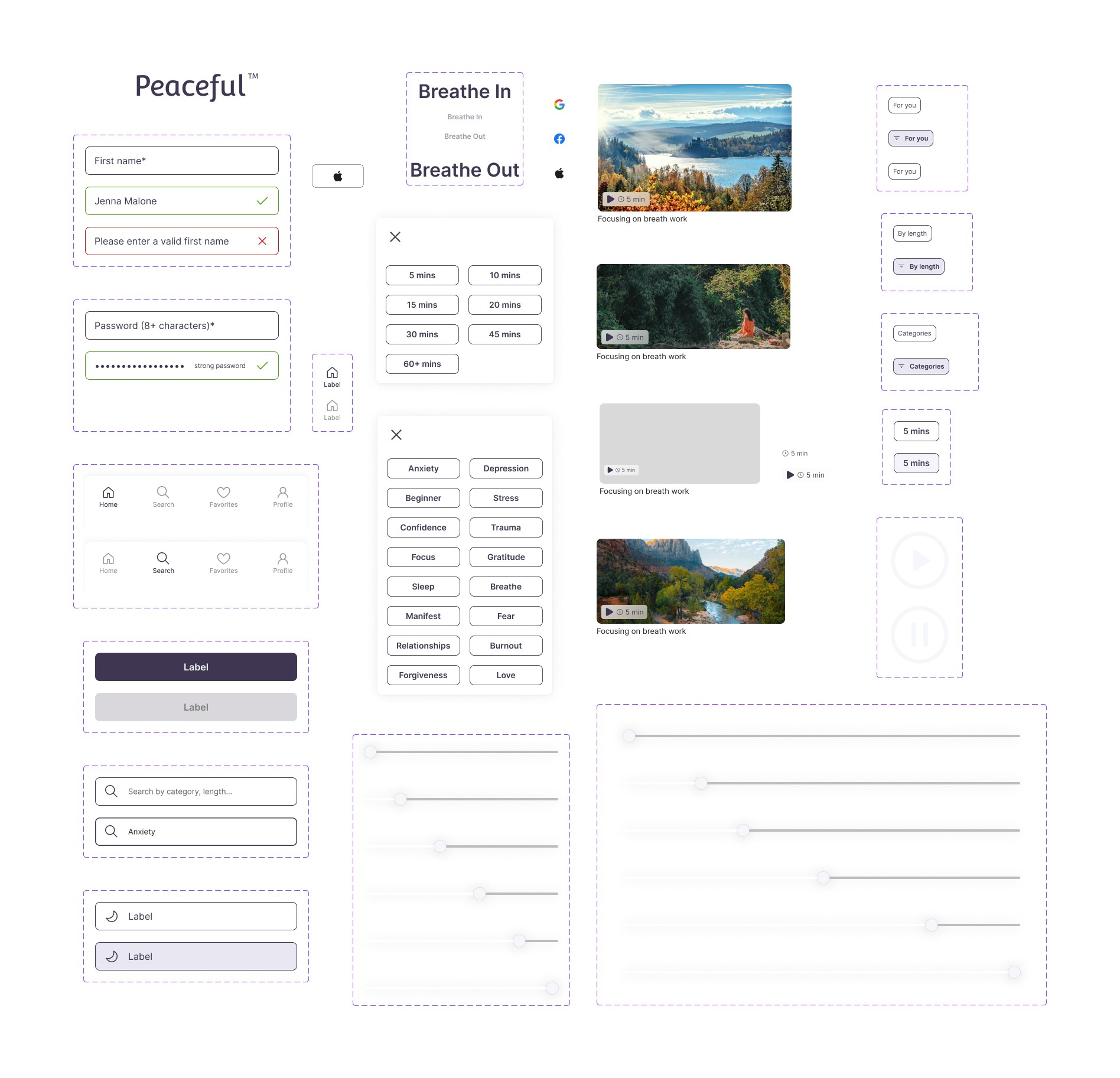
Components are a fundamental feature in Figma that significantly enhance the efficiency, consistency, and scalability of the design process.
